
Terms You Need to Know When Doing Your Own Graphic Design Part 2: Images and Illustrations
If you run a small craft business, you may also be doing all your own graphic design. But if you’re learning as you go, you’re probably running into tutorials that are aimed at experienced graphic designers and are filled with terms you might not understand. Whether you’re trying to choose a graphic design program or you just want to know what a “bleed” is, this series will explain common elements of graphic design and how they are used. See other posts in this series here.
Last time we talked about text-focused features; this time we’re discussing images and color.
Vectors (or vector illustrations)
This is one of the most important graphic design program features if you create line drawings or typographic art. Vectors are image files that can be easily scaled up or down to different resolutions and sizes. (If you are familiar with various file types, .svg, .ai, and .eps are vector files, .jpg and .png are not.) Have you ever tried to import a small image into a document and make it bigger, only to find that the lines get fuzzy and pixelated? Vectors won’t do that, which makes them great for creating schematics and crochet or knit charts that might need to be resized within the final pattern. The more basic design programs have limited ability to create vector files; Canva only allows SVG export to Canva Pro users, while Adobe Express has limited SVG conversion. To actually create and edit vector files directly, you will want to use Affinity Creative Suite, Adobe Illustrator or another program that bills itself as a vector graphics editor.
Raster or rasterized images (and DPI)
Raster images are those file types that don’t scale past a certain point - .jpg, .png, .tiff, and .bmp. Their size and clarity is dependent on the resolution of the image – if you’ve ever heard someone refer to the “DPI” of an image, this is the print resolution (it comes from the era of dot matrix printers where the higher the number of “dots per inch” printed on paper, the clearer and more detailed the image). These days, many graphic design programs can scale raster images to increase the DPI and make it clearer for printing or high resolution digital graphics, although some of the basic free programs don’t offer this (and even with a high DPI, at a certain point a raster image won’t be able to get larger without looking grainy). The general rule of thumb is that 300 DPI is the minimum resolution for high quality raster images in print and 150 DPI is best for digital mediums like websites, social media, and PDFs that aren’t intended to be printed.
I should note that DPI is NOT the same as PPI (pixels per inch) or screen resolution; people often mistake these terms as being interchangeable, but if you use PPI to determine print resolution you may wind up with disappointing results. For more, see this very thorough post on DPI vs PPI from the Photography Life blog.
The appeal of raster images is that their file size is MUCH smaller than vectors. Often a graphic designer will use vectors to create a scalable design and then export it to a raster image at the exact sizes they need, especially if they need a file that is below a certain size limit.
If you’d like to learn more about the pros and cons of individual file formats for vector and raster images, see this very thorough series over at Cloudinary.
Image Trace
What if you want to convert a raster image to vector or a sketch on paper to vector? Then you will need a function called image trace, which takes any raster image (which could be a standard photo or a scan of a drawing on paper) and literally traces a vector path over the lines, creating a vector version of the image. (You can see this process in more detail in my post about how I create digital illustrations for my stationary shop.)
This comes up often for knit and crochet pattern designers and other small craft businesses in terms of garment schematics, assembly diagrams, and logo creation. It’s also very handy if you have an old raster version of your logo or another image that you want to convert into vector so it can be resized or updated.
In my personal experience, Adobe’s robust image trace feature is (as of 2026) still one of the best available. In addition to being able to fine tune the settings of the trace within Illustrator, the Adobe Capture app (which comes with an Illustrator subscription) allows you to instantly create a vector graphic just by taking a photo of your drawing with your phone. Affinity has just added image trace to its most recent version of Creative Suite and does not have a direct app.
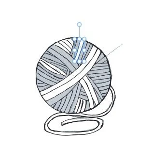
The photos below show how Adobe Capture and Affinity’s image trace tool process the same pen sketch. A photo of the original sketch on paper is first (or on the left depending on your device), followed by a screen shot of the image in Illustrator after being converted through Adobe Capture. The third image, a screen shot of the image after running through Affinity’s image capture tool, had that light gray all over the background initially — to get a line drawing like Adobe Capture, I had to select and remove those gray fields myself (the photo shows the drawing partway through that process). However, if I had intended the yarn to have a color, Affinity filling in the background would have allowed me to select a color easily; Adobe Capture would have required use of one of Illustrator’s paint or color field tools to achieve that.


Not everyone needs image trace – if you prefer to create your images with a stylus or a mouse directly in a vector editing program and/or already have all your key logos and images in vector files, you may never need image trace. It is a good feature to understand, however, in the event that you do someday have a non-vector image or paper drawing you’d like to convert to vector.
RGB vs CMYK
If your graphic design work will ultimately be printed, you should also know the difference between RGB and CMYK color spaces. These color modes represent different ways of creating color – while computers use various combinations of Red, Green, and Blue (RGB) to create shades, traditional paper color printing used four passes of ink in the colors Cerulean, Magenta, Yellow, and black (CMYK), and continued to use those four colors as the basis for their inks even as computer printing became more common. (If you’ve ever wondered why you have trouble picking a color on your computer that looks the same when you print it out, you may be working in RGB but printing on a CMYK printer.) Although RGB is now accepted by some printers if the job will be printed on a digital printer, CMYK is still the preferred color setting for most paper printing, and is required for offset printing, which is the sharpest form of commercial printing and used for most books and magazines. See this great post from a professional printer for additional details, including what to do if you’ve created a file for printing in RGB mode.
A full-feature graphic design program such as Adobe Illustrator or InDesign, or Affinity Creative Suite, will offer the ability to switch your file between RGB and CMYK mode but some of the more basic online programs, including many photo editing programs, often only offer RGB mode. If you are designing files for both digital and print use, you may want to look closely at how your graphic design program of choice handles color conversion.
Getting your images right can feel particularly stressful when doing your own graphic design; hopefully this post has helped explain some of the common terms you’ll encounter around images and features you should think about when picking a graphic design program. And don’t forget, if it’s just too much for you to take on yourself, I’m always available to help with schematics, charts, logos, and more!
I’m Whitney, a tech editor, graphic designer, and lifelong crafter. Join me for an exploration of my latest knitting, crochet, sewing, and upcycling projects, tips on knitting technique, editing tips for knitting designers, and more!