
How I Create Hand-Drawn Vector Illustrations
If you follow me on Instagram, you know I’ve recently been running a small series about my illustration process while designing a gift for my newsletter subscribers. If you missed any of those or just don’t want to be on Instagram (understandable), never fear! This post compiles the whole series and adds a few extra fun details (and photos) I didn’t have room for.
I knew I wanted to do a printable download for my subscribers, something they could easily print on their home printer. After kicking around a few ideas, I hit on the idea of a snail mail planner – a chart with spaces for each individual month, where you write in any birthdays, anniversaries, or other dates you want to send people cards for. My mom had one of these when I was a kid hanging next to our calendar, and it was really useful to see at a glance what days were coming up and plan your card purchasing in batches (even now, with electronic calendar reminders, I like being able to see the entire list at once rather than one calendar reminder at a time). But I wanted a fun little illustration to go on the calendar rather than just a bunch of boxes.
Step 1: The Initial Sketch

When I start sketching an idea, I’m also thinking about how I’m going to digitize it later. Depending on how complicated the drawing is I might draw the final version in pieces and assemble it in the computer, but this little guy worked better as one complete sketch. Once the rough sketch is complete, I clean up some of the extra sketch lines and places I’m not as happy with (I decided to redo that left eyestalk to be a better match to the right one, for example).
I should note that I knew from the beginning I wanted to do a “snail mailman” but I didn’t just draw this straight from my brain, I did look at a few reference images of cartoon style snails to help me get a sense of the proportions and ideas for tackling certain details (like the spiral on the shell). I like to mention that because I find one thing that intimidates people about drawing is thinking they have to spontaneously sketch an idea without any reference points — lots of artists use reference images or models to help get proportions or angles correct! I like using either image search or Pinterest boards, because I find looking at multiple reference images helps me come up with an idea that isn’t a copy, it’s a mix of elements inspired by different drawings and elements I came up with completely on my own (none of the reference images I looked at had a scarf, for example).
Step 2: Outlining and Digital Conversion
I don’t always outline my drawings before I digitize them, but for this project I wanted the lines to be very clean (vectorizing pencil gives a rougher sketch effect).

Vectorizing a hand drawn image or photo is done with a tool called “image trace.” I generally use Adobe Capture for this – it comes with my Illustrator subscription, and really simplifies the image trace process, but there’s many tools out there that do the same thing* if you don’t have Adobe. I will sometimes use Illustrator’s in-program image trace tool when I want more granular control over how the image looks once digitized, as the settings are more customizable.
*-Between the time I wrote this and when the blog posted, Affinity actually announced a new, free version of its Creative Suite that does seem to include some kind of image trace for the first time, but I haven’t had a chance to play with it yet.

Once my illustrations are transferred into the computer, there’s always a little extra clean up needed – for characters like this snail, I nearly always redo the pupil in the design program because the elliptical/circle shape tool has better definition than anything I can hand draw.
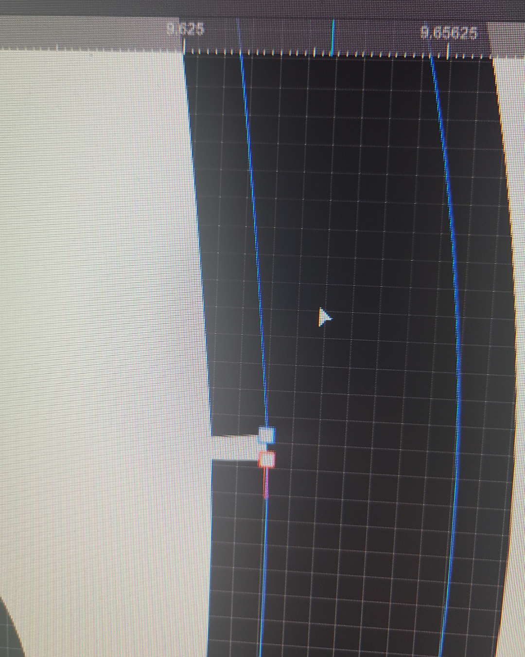
I also zoom in very close to each line and look for any stray dots or peaks that need to be smoothed out – when I’m going for a sketch-like aesthetic I may leave a few of those in, but for a clean drawing, the smoother the line quality, the better. For this particular drawing I made the outline a little thicker after vectorizing, and that created a bunch of odd little gaps that I had to fix by moving those white “nodes” closer together.
Step 3: Typography and Layout
In addition to my mail snail drawing, I decided to hand-letter part of the wording I had planned for this project, and also draw a few simple envelope shapes. So once that was all vectorized and cleaned up, I did a little experimenting to get a layout I wanted. I’ll also note that, though I use Adobe’s tools to convert my drawings into vectors, I do most of my artistic illustration in Affinity Designer these days (unless a client specifies otherwise), as their tools match my workflow better.
While I often use an existing font and just tweak the proportions to get different effects, I wanted the word “snail” to be reminiscent of a snail shell in a way that would be simpler to draw (if you’ve seen my Sheep to Sweater wall hanging on Spoonflower , I hand lettered that entire title for similar reasons).


Layout, as it often does when I need to fit a certain amount of info on one page, proved a little tricky. Since I needed to get twelve envelopes for the twelve months on an 8.5 by 11 page and stay inside the .5 inch margins most home printers can handle, trying to figure out where to fit the snail and the title lettering took some experimenting. I was okay with a little snail overlap on the envelopes, but the tail kept covering more space than I wanted. It finally clicked when I realized I could tuck him between two rows in a way that looked like he was moving out from between them.


Step 4. Coloring
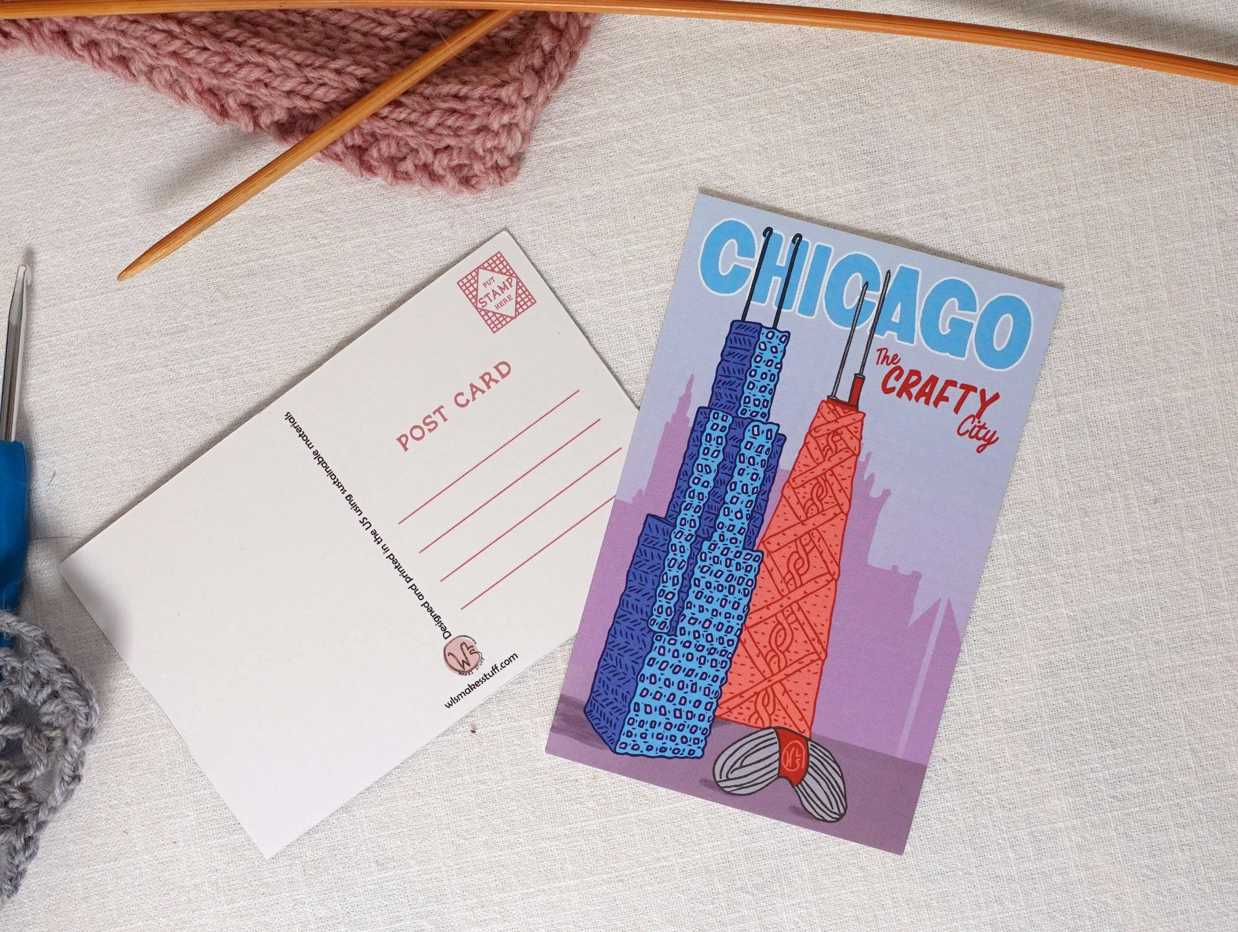
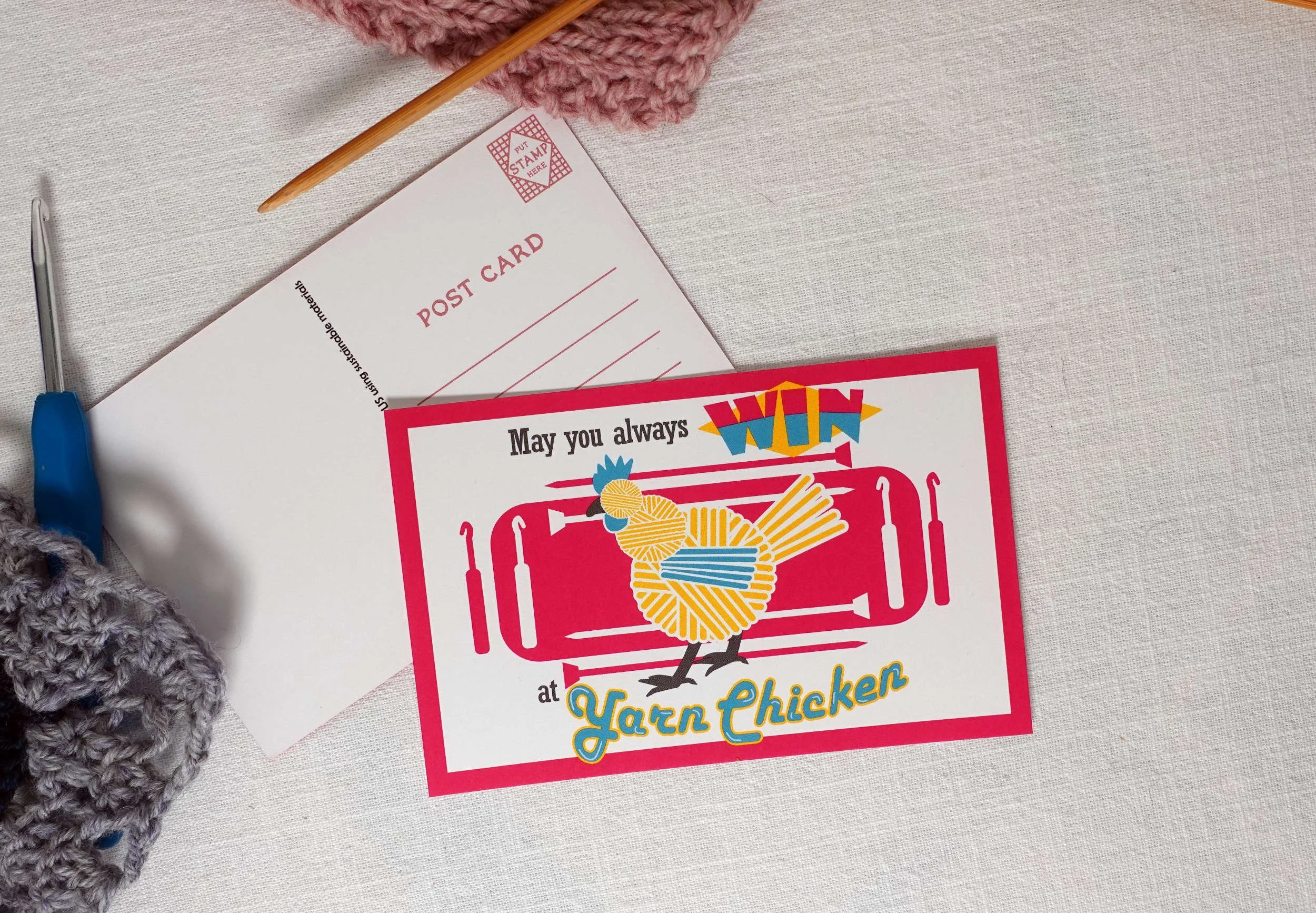
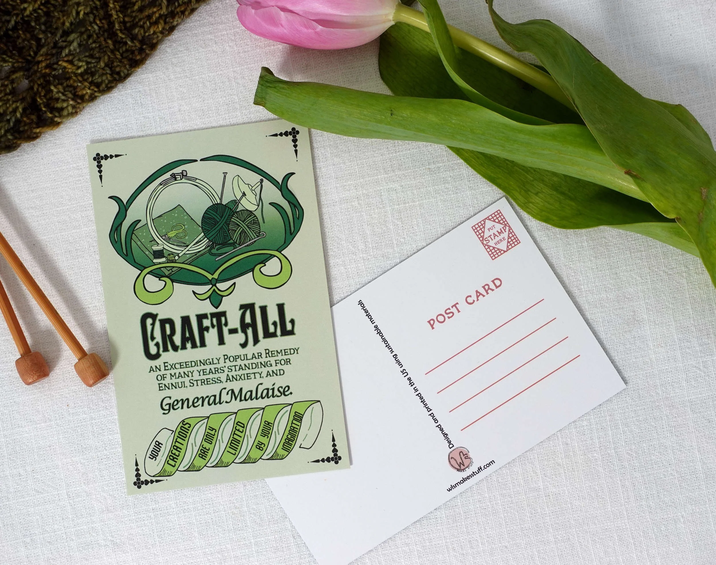
I am very indecisive about color and so I prefer to do all my coloring in the computer where it’s easier to play around with options. This time I made it a little easier on myself by using a combination of my brand colors and the colors from my Purlworthy card design, which I think pops really nicely in print.
I also want both a black and white and full color version of this document so once the layout was set I duplicated it onto a separate layer before adding color, to make it easier to work back and forth.

When you start with a fully black and white digital illustration, though, it can be difficult to break up different pieces into different colors (especially if you want the outline colors to change, as I did for this piece). My favorite trick these days is to duplicate the outline and then cut out just the piece I want to be a different color. I particularly like Affinity Designer’s Knife and Node Editing tools for this, it made fixing the pictured section, where one of the snail’s spots was under the scarf fringe, much easier.
One of the final things I do when designing is to convert any special fonts I’m using to curves, as even if you embed fonts there are some programs that just won’t read them correctly and will substitute a default font (*cough* Google Drive *cough*). Converting to curves also occasionally causes some odd artifacts to appear in the pdf that aren’t visible in the design program; I like to use fonts with a hand-lettered feel, which usually means shapes with more nodes and thus a higher chance that there will be a conversion problem in the PDF. That didn’t happen this time, thankfully.
Because I intend this to be a printable object I also tested both PDF versions by printing them on my home printer to make extra sure no part of the design got cut off and that everything prints correctly — obviously, every home color printer is a little different, but some colors print with more or less saturation than how they appear on screen so I’m making sure the color palette seems balanced on paper. Also, this particular time it was the black and white version that needed adjustment - it was printing the word “Planner” as white ink when it was supposed to be reading it as a transparent background (and thus whatever color the paper is). But after making that tweak, we were all finished!

The black and white version looks a little gray here due to the sun exposure - it definitely prints in true black.
This Snail Mail Planner is now a free newsletter exclusive; if you’re subscribed to the newsletter you can download and print either the black and white version or the color version, whichever you prefer! I’ll be releasing this in the November 2025 newsletter (which goes out on the 13th), but if you’re finding this post long after that you can still sign up for the newsletter at any point and get access to the newsletter exclusives section of my website.
If you enjoyed this look at my design process, don’t forget I’m available for commissioned merch, logos, and all kinds of graphic design for small craft businesses (including pattern layouts, charts, and schematics). My Graphic Design Services Page will tell you more about what I do, or contact me to discuss your project!
I’m Whitney, a tech editor, graphic designer, and lifelong crafter. Join me for an exploration of my latest knitting, crochet, sewing, and upcycling projects, tips on knitting technique, editing tips for knitting designers, and more!